See it with real numbers
See the next move before you enter your own numbers.
Walk through MyDebtLens with a realistic sample debt picture before choosing a plan. You enter nothing personal in the demo; it opens at the Dashboard and shows how the app explains monthly pressure, compares payoff routes, checks whether a tested payment fits the current month, and turns the numbers into plain-language context.
No signup, no bank connection, and no personal numbers required. The demo opens with sample data.

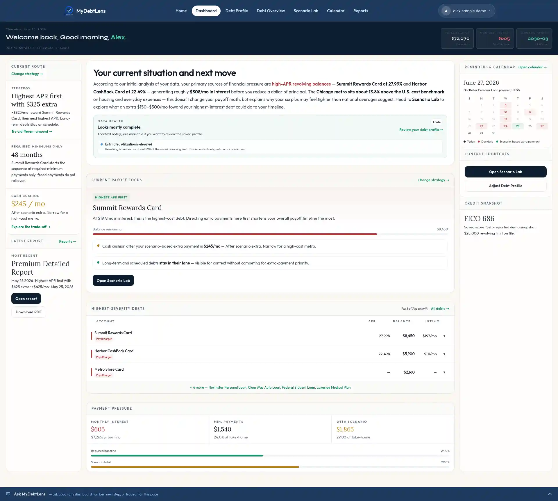
1 · Dashboard
Start with the next move, not a pile of balances.
The demo opens on the Dashboard because the sample profile is already complete. It brings together debts, income, expenses, credit context, reminders, and the selected scenario into one current-route view.
- Alex sees the highest-cost payoff focus instead of guessing which balance deserves attention first.
- The current route shows the selected plan, required-minimums reference, cash cushion, latest report, and calendar context.
- Payment pressure and highest-severity debts stay visible without turning the page into a spreadsheet.
2 · Debt Profile
Enter the numbers the app will interpret.
Debt Profile is the input page behind the interpretation. It keeps balances, APRs, payments, due dates, income, expenses, monthly cushion, credit context, and reminder preferences in one editable profile.
- Debt details can be updated as balances, rates, payments, or due dates change.
- Fixed bills and flexible spending are separated so monthly cushion is easier to understand.
- No bank connection is required; the app works from numbers the user chooses to enter.
3 · Debt Overview
See where payoff pressure really comes from.
Debt Overview separates payoff targets from scheduled, long-term, and outside-plan accounts. It also turns income, living expenses, debt payments, and calculated monthly cushion into a readable money-flow map.
- Payoff targets are separated from scheduled and long-term obligations.
- The Sankey-style money-flow view shows how take-home income is being allocated each month.
- Each classification has a plain-English explanation instead of a mystery label.
4 · Scenario Lab
Compare routes before committing to one.
Scenario Lab compares the selected plan against required minimums, then shows how the payoff timeline, estimated interest avoided, and current-month cushion change when the monthly extra payment changes.
- Alex compares all eligible debts or revolving balances only against the required-minimums reference.
- The sample route tests a realistic $325/mo extra payment before asking whether the month can support more.
- The payoff timeline includes quick range buttons, a draggable timeline selector, and cards for last payment dates and estimated interest avoided.
5 · Calendar
Check whether the plan fits this month.
The Calendar keeps debt due dates, income markers, recurring expenses, planned expenses, and scenario-based extra payments in one timing view, then pairs the month grid with a money-flow map.
- Debt payments, income timing, recurring bills, and planned expenses are visible in the same monthly grid.
- Scenario-based extra payments remind the user to review the chosen route before relying on it.
- When the tested payment pushes the month too far, MyDebtLens explains the shortfall instead of hiding it.
6 · Reports & workbook
Turn the plan into a written interpretation.
Reports turn the current debt picture into a plain-English explanation, while the payoff workbook gives spreadsheet-level detail when the user needs it.
- Premium Detailed Reports explain the current situation and selected route in plain language.
- Snapshot Reports preserve a shorter view of the saved assumptions.
- The Payoff Workbook supports deeper review without making the app feel like a spreadsheet.